Website reimagined for clarity, excitement and engagement
See how we modernised the National Bingo website with new features, clearer content and a vibrant, user friendly design that increased engagement
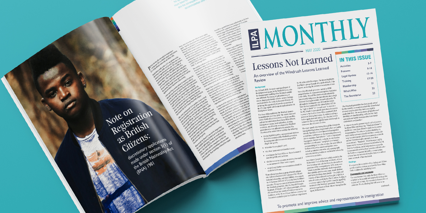
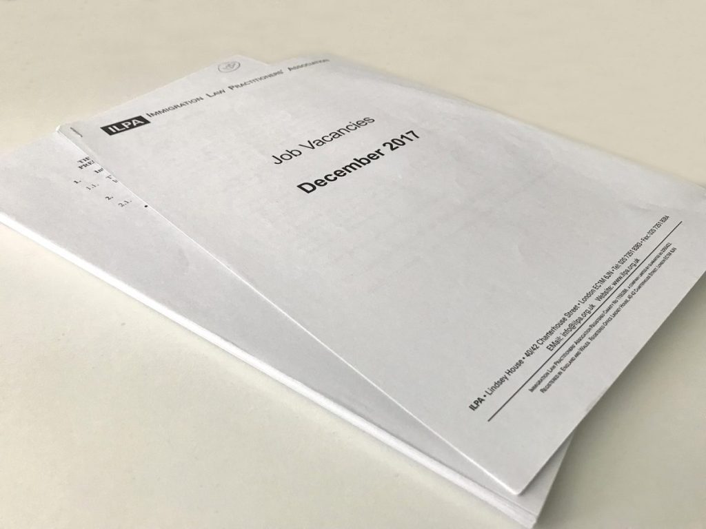
ILPA approached us to help revamp their monthly Member newsletter. They had been using the same format for years which was “very basic and looks quite outdated”. The internal process was labour intensive with multiple documents requiring hand numbering before being photocopied, collated and – along with sheets of printed labels – taken to the local mailing house to be fulfilled, franked and mailed.
They wanted a template designed that either they or we could update each month and needed the whole production process to be streamlined.
As briefed, we costed up the parts of the newsletter that needed redesigning and quoted on the production process. However, it quickly became clear that we could add far greater value with a different approach.
A first meeting with the communications team was enlightening as we were able to establish the exact purpose of the newsletter, how it was being used by the Members and how ILPA felt it could better meet everyone’s needs.
From this we put forward a revised proposal that greatly reduced the amount of internal work, better suited the needs of members – by including a digital version with links for more expansive reading – and crucially, added nothing in cost.
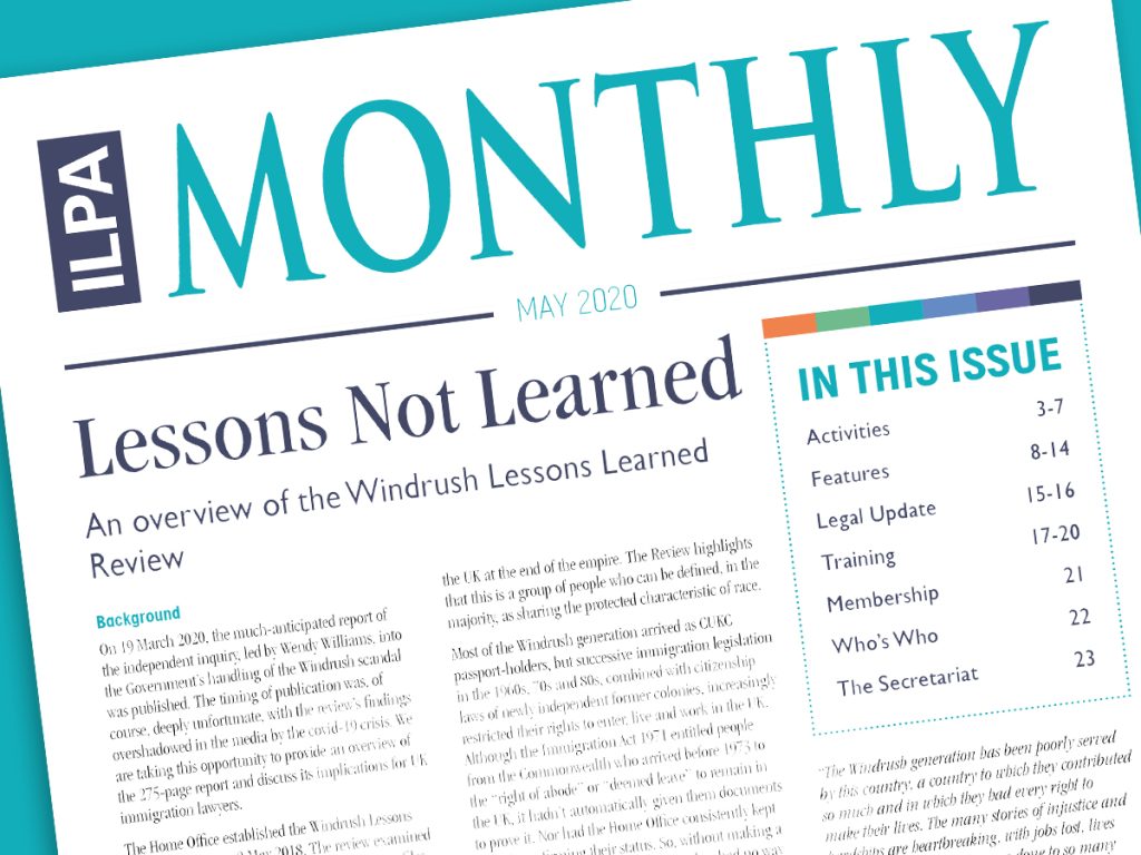
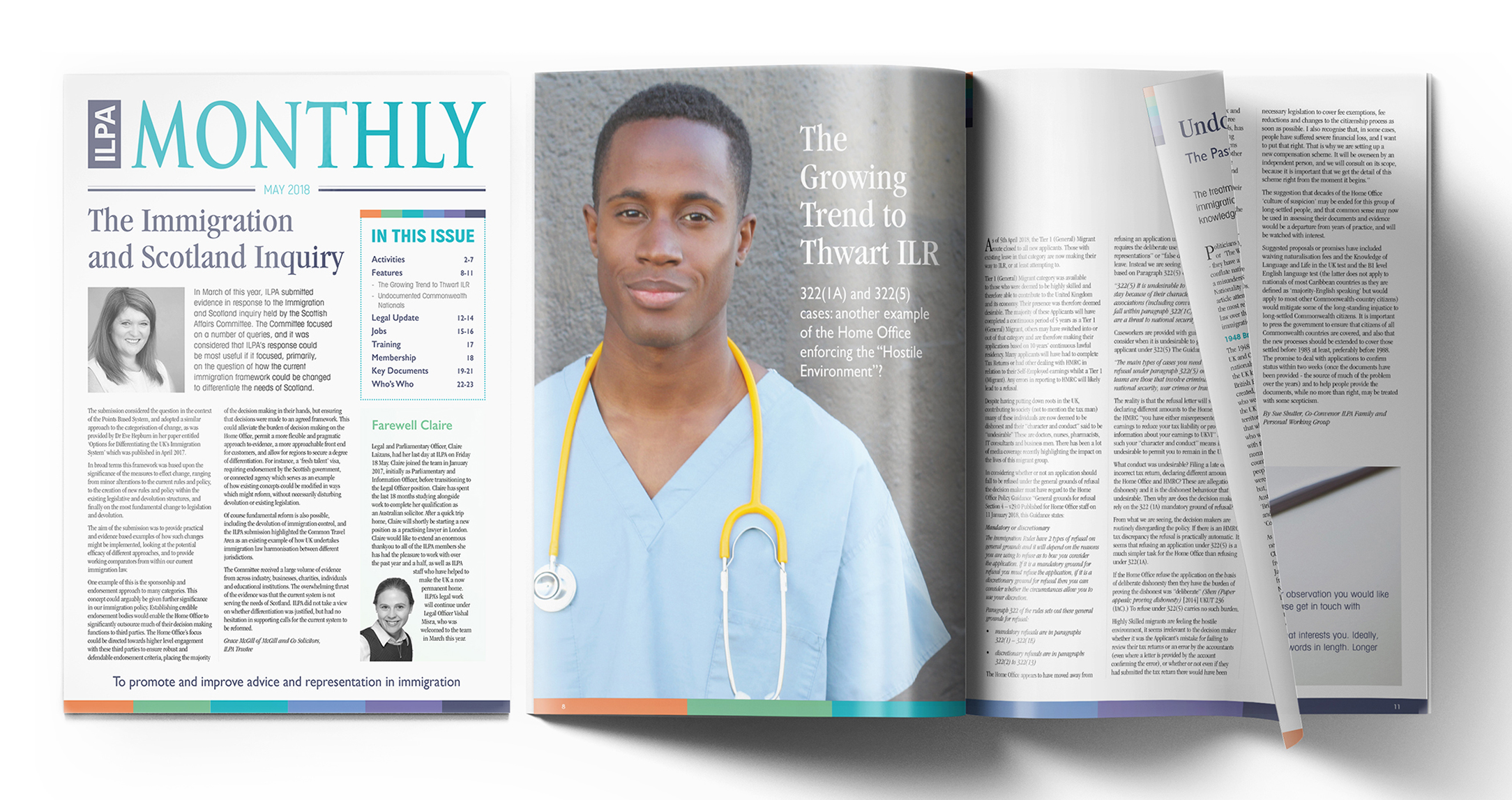
The Newsletter has changed from a – largely photocopied – collection of single colour documents often numbering over 100 pages to a sleeker 20pp full colour newsletter, that includes essential updates with signposting for members top read more online.
I felt compelled to call to say what I thought about the newsletter I received today. Beautiful! Fantastic! Amazing! Magic! I love the colours, the design, and the formatting, and am looking forward to receiving many more glossy ILPA mailings in the future. Well done, ILPA—Keep up the great work!
Obi, OJN Solicitors
See how we modernised the National Bingo website with new features, clearer content and a vibrant, user friendly design that increased engagement
Complete rebuild of Basil Fry’s website with clear navigation, strong CTAs, and improved UX, resulting in higher traffic and more customer enquiries.
How do you make a sensitive topic feel clear and approachable? By blending expert insight with accessible language, this piece informs, reassures and guides readers with confidence.
See how our impactful, on brand graphics and subtle animations supported the mydeposits Switch Campaign and helped grow their customer base.
Facing increased competition from other independents and chains, Rubicon were engaged to create new branding and marketing collateral to increase customer enquiries.
Get in touch today to discuss your
project – big or small. Call 0117 957 5400 or