mydeposits

Creating a graphic series to boost visibility and grow a customer base

The challenge

mydeposits approached us to support their goal of growing their customer base by producing a series of digital graphics for their nationwide Switch Campaign. They needed eye‑catching, high‑impact visuals that could be used across email headers and social media. Graphics that were instantly recognisable, succinct in messaging, and capable of running as a cohesive series over a period of time.

Working with mydeposits also meant adhering to their strict brand and graphic requirements. All visuals needed to remain fully 2D, follow their defined colour palette, and maintain a clean, professional style. The challenge was to create a campaign that felt fresh, bold, and memorable while staying firmly within these visual constraints.

Our approach

To bring the concept to life, we developed a series of graphics inspired by the core idea of “switching”, mirroring the campaign’s purpose of encouraging landlords and agents to switch to mydeposits.

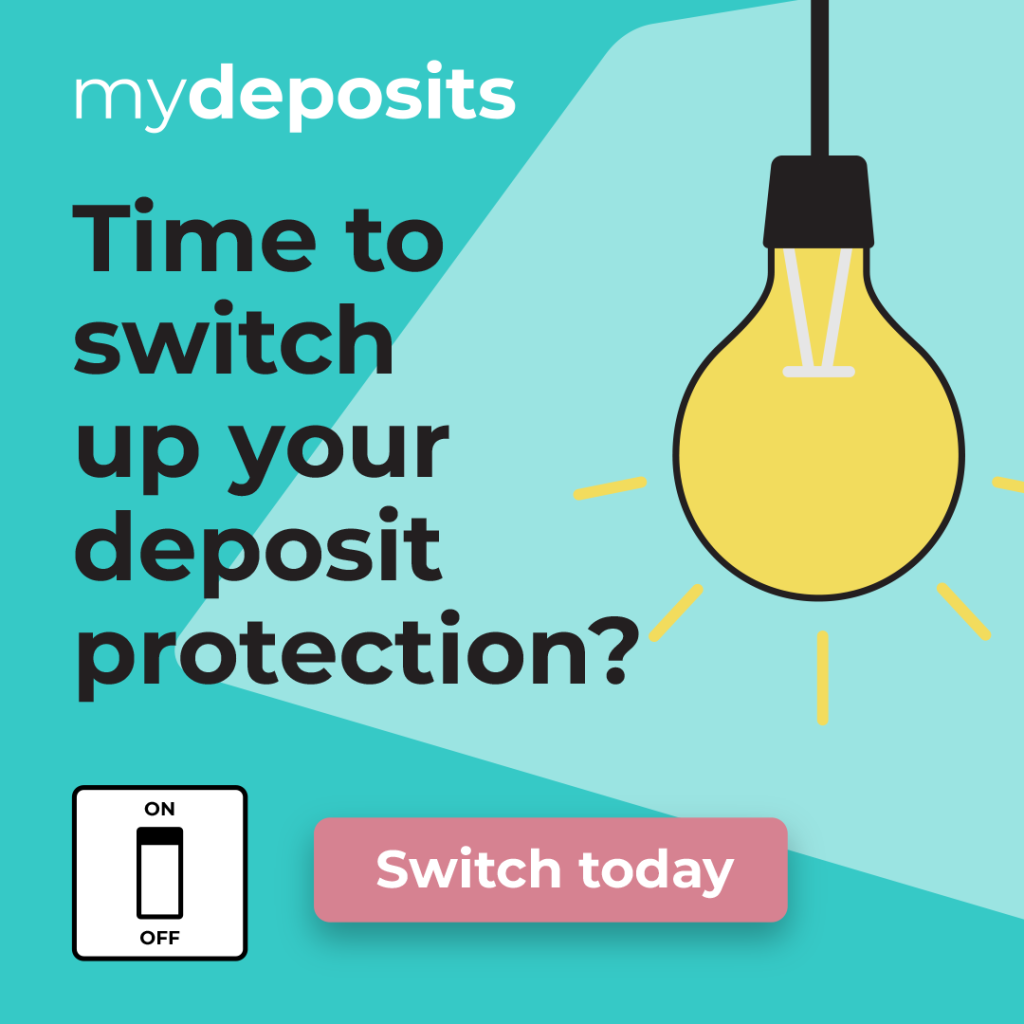
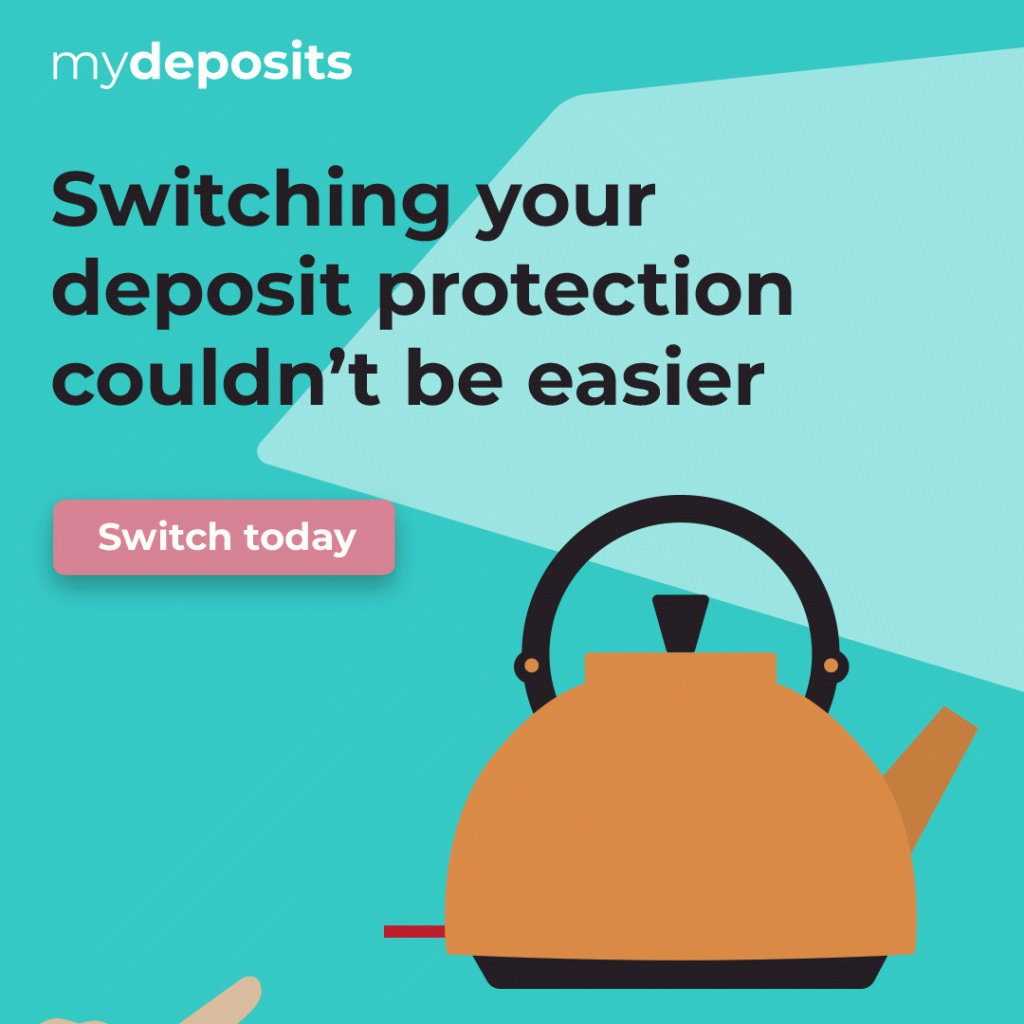
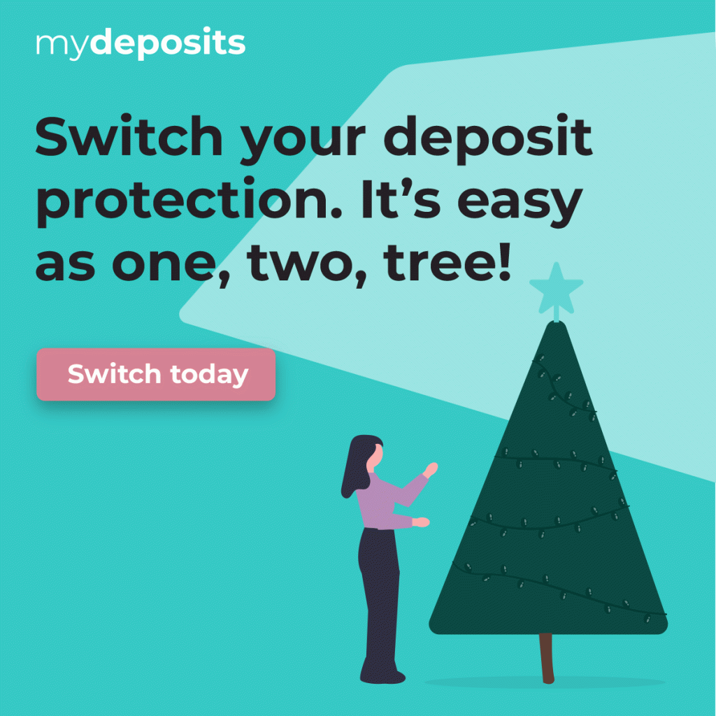
We designed a set of simple but impactful visuals featuring everyday objects associated with switching or turning something on:

  • A light switch and bulb
  • A kettle being switched on
  • A Christmas tree with switched‑on lights and baubles (to tie into the festive season)

These illustrations delivered a clear metaphor: switching to mydeposits is as simple and positive as switching on everyday essentials.

Despite the strict 2D requirements, we ensured every graphic felt vibrant and noticeable by using bold compositions, clear shapes, and confident use of the mydeposits colour palette. To give the visuals added personality, we incorporated subtle animations, bringing a sense of motion and life without breaking brand guidelines.

Once the graphics were created, refined, and approved, we supplied them in formats ready for integration into mydeposits’ internal systems, optimised for email headers, social channels, and campaign messaging.

The results

The final graphic series delivered the impact mydeposits needed. Bright, bold visuals that stood out online while remaining fully aligned with their brand identity.

The campaign’s clarity and cohesion helped strengthen recognition across platforms, and when combined with mydeposits’ targeted email activity and promotional messaging, it contributed to growth in the number of deposits protected during the campaign period.

The Switch Campaign visuals successfully:

  • Increased visibility across email and social channels
  • Provided a consistent, recognisable creative theme
  • Brought energy and clarity to the campaign using simple, effective animations
  • Supported the organisation’s push to grow their customer base

The result was a memorable creative series that delivered both engagement and measurable commercial value, helping encourage more landlords and agents to switch to mydeposits.

Other work

Other work

Like what you see?

Get in touch today to discuss your
project – big or small. Call 0117 957 5400 or 

error: Content is protected !!