Inclusive Change

Building a brand that champions neurodiversity and inclusion

The challenge

Inclusive Change approached us at a pivotal moment in their development as an organisation. Their mission was clear and ambitious: to help workplaces and communities achieve greater success through a deeper understanding of neurodiversity and disability. They offered consulting, training, and strategic support designed to remove barriers, celebrate difference, and create environments where every individual could thrive. What they lacked was a visual identity that could communicate this purpose with clarity, warmth, and confidence. They needed a brand that reflected growth, inclusion, and the richness of human diversity, something that would resonate with organisations seeking meaningful cultural change. Our challenge was to translate their values and vision into a logo and brand system that felt modern, optimistic, and representative of the spectrum of experiences they champion.

Our approach

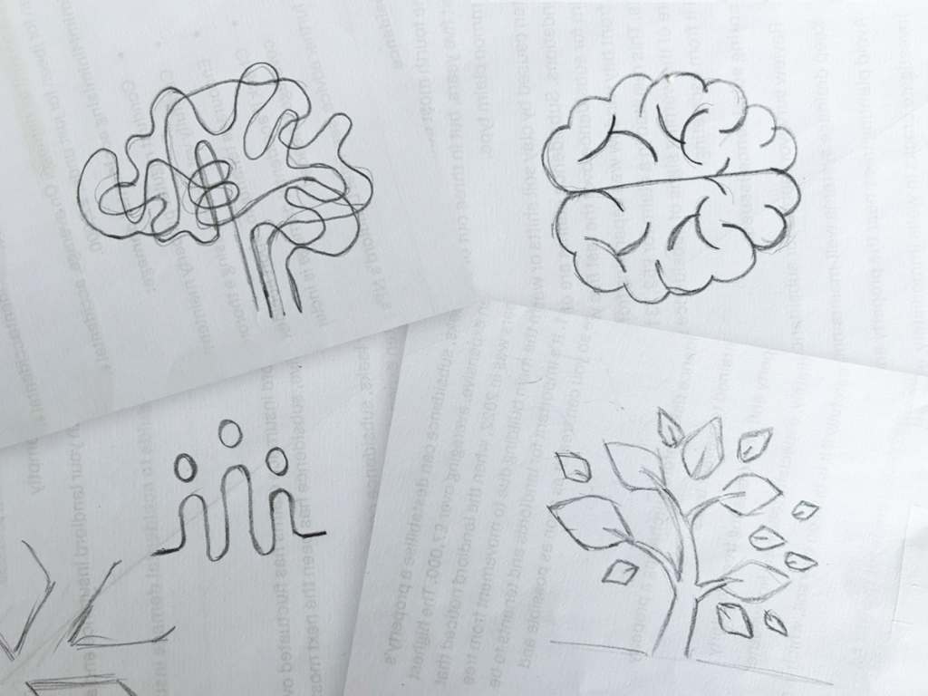
We began by exploring a wide range of visual concepts rooted in the organisation’s core themes: growth, inclusion, the brain, the spectrum, colour, and people. These ideas became the foundation for our early sketches and digital explorations. We looked at how shapes, colour palettes, and symbolic forms could express the complexity and positivity of neurodiversity without relying on clichés or overly literal imagery. Through close collaboration with the Inclusive Change team, we refined the strongest directions, developing a visual language that balanced professionalism with approachability. The final logo was crafted to feel dynamic and human, capturing the idea of individuals and organisations evolving together. Once the identity was approved, we produced a full set of brand guidelines, ensuring the organisation had a clear framework for consistent application across print, digital, and training materials.

The results

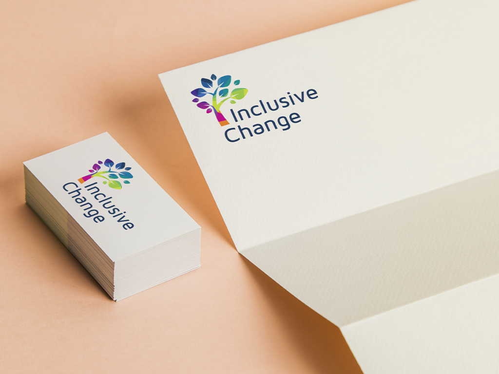
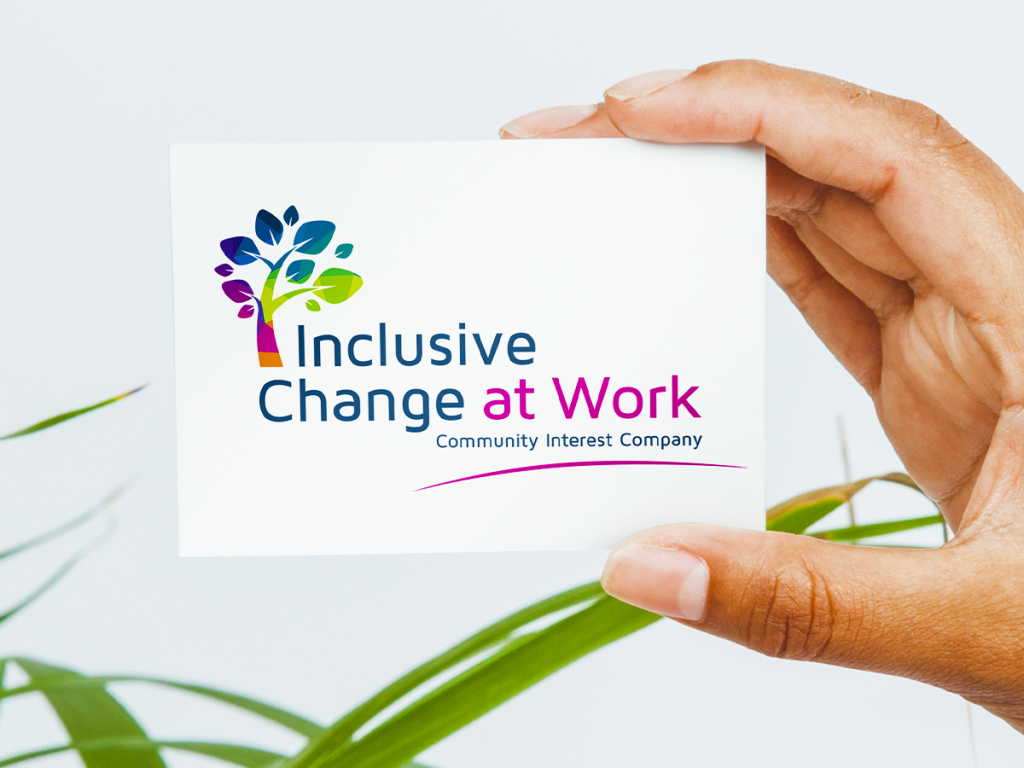
The new brand gave Inclusive Change a confident and recognisable presence—one that aligned with their mission and supported their growth. The visual identity communicates inclusivity without being prescriptive, allowing the organisation to speak to a wide range of audiences across sectors. The use of colour and form reflects the diversity of minds and experiences they advocate for, while the overall design reinforces their role as a positive, forward‑thinking partner in organisational change. With a strong brand foundation in place, Inclusive Change is now equipped to expand its reach, strengthen its message, and continue driving meaningful progress in workplaces and communities.

Other work

Other work

Like what you see?

Get in touch today to discuss your
project – big or small. Call 0117 957 5400 or 

error: Content is protected !!